 Here’s a quick little art experience you might like to try with your students that will help them explore the differences between positive and negative shapes and space.
All you need are 3 sheets of white paper per student — even copy paper will do — some small pieces of scratch paper, pencils, and cotton balls or tissue.
To begin, ask your students to cut a shape out of their first sheet of paper. Depending on the age and ability levels of your students, the shapes can range from simple, free-form organic shapes, to something much more complex. You will want to have them cut out their shape so that when they are finished, they are left with two things: the shape itself that they cut out, and the outside edge of paper around what they cut out.
Have them place the paper that they have left over from cutting out their shape, on top of their second piece of paper. (You might want to have them tape the top and bottom pieces of paper together to prevent movement.) Using a pencil, have them rub a patch of lead onto a piece of scratch paper. Using a cotton ball or a tissue, have them pick up some of that pencil lead and begin to rub it from the outside edge of the paper toward the center open space left by the shape they cut out.

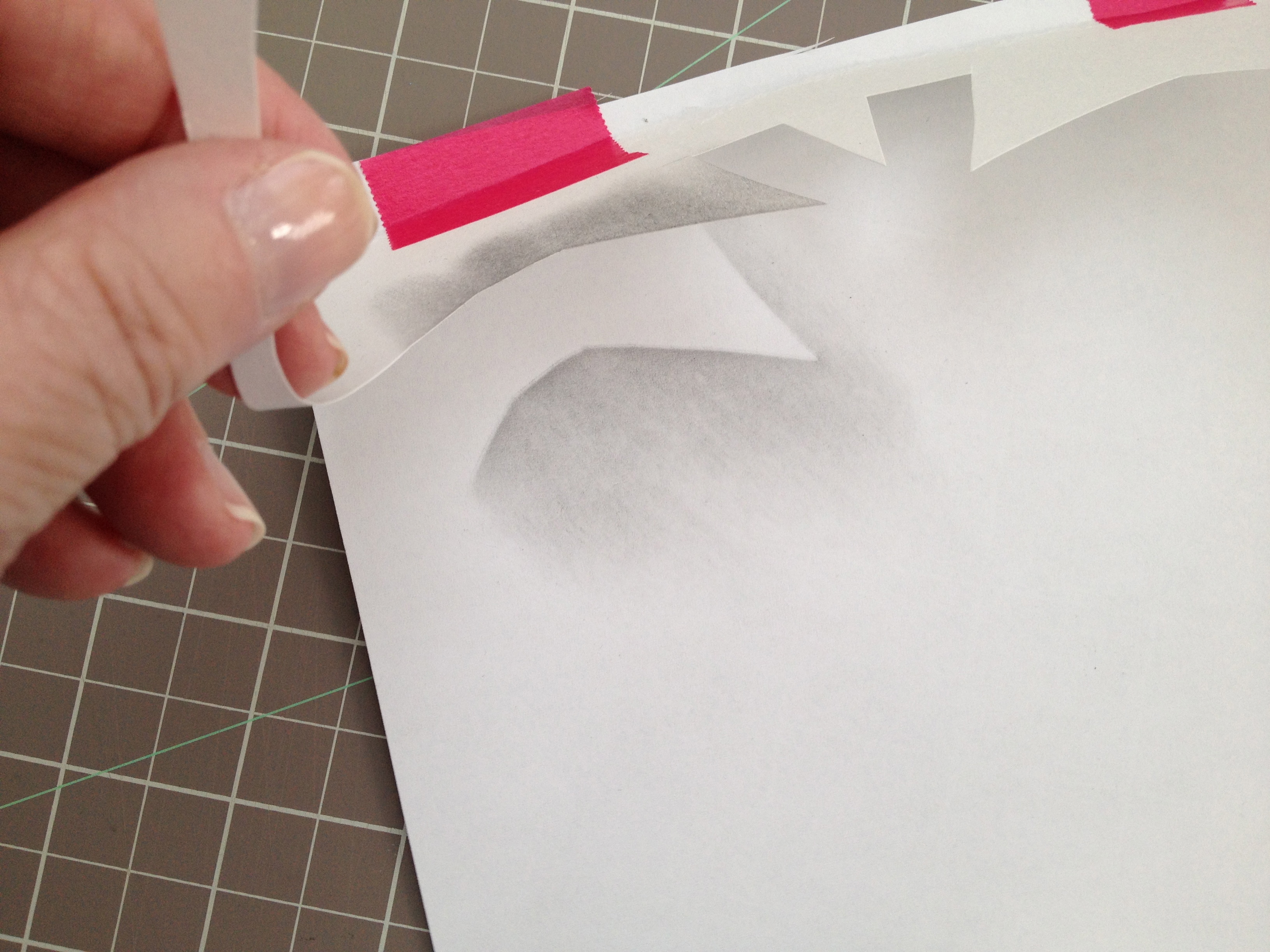
Continue this process of rubbing pencil lead from the outside edge in toward the center, until they have filled the center with pencil shading. Carefully separate the two sheets of paper. What they are left with is a shaded image of their shape. This shaded shape is the “positive” image. If you were to peek under an edge while they worked, it would look like this:
Next, ask your students to carefully position the actual shape they cut out on top of their third sheet of paper. (You might consider having your students place one or two tape loops underneath their shape to keep it from moving around.) Using the same pencil lead and cotton ball or tissue, this time you are going to ask your students to rub from the shape itself onto the paper below.

Have them continue rubbing from their shape onto the paper underneath it until they have rubbed all the way around. Ask them to carefully separate the two pieces of paper, set their actual cut out shape aside, and what they will be left with is an image of their shape determined by the shading around the outside of it. This is the “negative” image of their shape. If you were to peek underneath their shape while they were working, it would look like this:

Try this yourself first so you can see how easy and fun it is to do. Kids are always delighted by this experience because the results seem so magical!
Looking for more art lessons like this one to incorporate into your classroom curriculum? Check out my affordable, convenient, and self-paced Professional Development course offerings through Fresno Pacific University here. This particular lesson is part of my class called Drawing Magic.

