 With graduation season upon us, and another school year drawing to a close, this is a great time to help students think about where they’ve been, where they are, and where they’re headed. The “My Life” pop-up book is a small, three-section book that invites students to think about significant events/people/places from their past and present, and to imagine their future. Breaking the book down into these three main time-frames will enable your students to more easily focus on significant details without being overwhelmed.
Here’s what you’ll need: Sheets of 9×12 inch construction paper in a variety of colors, construction paper scraps, scissors, tape, staples, glue, and markers. You might also want to include other materials such as brads, cotton, yarn, buttons, ribbon, string, fabric scraps, hole punches, and construction paper sheets larger than 9×12.
Each child will ultimately need 6 sheets of construction paper — 1 sheet for each of the three pop-up sections, and 1 “backing sheet” for each section. Because this book will consist of 3 separate sections, students may begin on any section they choose — past, present, or future. After all sections are complete, the book may be assembled in the correct order.
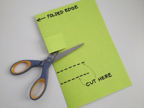
Begin by demonstrating how to make a simple pop-up tab. Fold one sheet of 9×12 inch construction paper in half, and make two parallel cuts along the folded edge for each pop-up tab you want to have, like this:
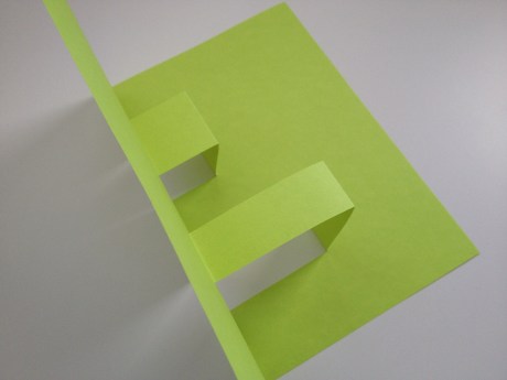
After cutting, open your paper, and push the tabs you just cut to the “inside” of your folded paper. Close the folded paper with your tabs inside. When you open the folded paper back up, your tabs should stand up like this:
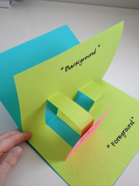
Elements that will pop-up when the book is opened will be attached to the front of these “tabs”. Encourage your students to get fully involved in the surface decoration of each section of their book using construction paper scraps and any other materials that you have provided. For example, if their own birth is the significant event from their past that they want to represent, perhaps they will have a small crib as one pop-up element, with another being a large cut-out of the numbers for the year they were born. The “background” of the scene could be decorated like a wall in the baby’s room, and the “foreground” area decorated like the “floor” of that room. In other words, encourage the creation of entire settings or scenes to fully represent their significant event/place/person, etc.
Depending on the age and ability levels of your students, a bit of writing for each section can be included to add depth and description to what they’ve created visually.
After a section is complete, a second sheet of construction paper should be folded in half and attached to the back of the section sheet like this:
Once all three sections — and their backing sheets — are finished, the sections can be connected together using staples, double-sided tape, or glue. (Hint: you’ll need to be very patient if you use glue!) If you desire, you can have the students decorate the “cover” sheet of their book. For a more finished look, you can wrap a larger sheet of construction paper around the outside of all three sections of the book, and after attaching it, trim off any excess. (A 9×12 sheet won’t be large enough once you’ve connected all three sections of the book together.) This then can be decorated as the cover.
Not only will you learn a great deal about your students during this process, but they will love sharing the highlights of their lives with you and with their friends.
Interested in more fun art ideas like this one? Check out the affordable, self-paced, and convenient professional development art classes I teach through Fresno Pacific University here!


